As you can see, new header up! I am very satisfied with how it turned out. ^_^. For those of you who just discovered the existence of my blog recently, yes, I made 4 headers before this. Used the previous one for quite a long time compared to the others.

In this post, I will be talking about the previous banners and also how I made the current one since I didn’t have such a post for each of the banners. This is actually for myself to remember, but if you have nothing to do and do not know what to do, go ahead and read, lol! XD
[click the images for their real sizes]
First banner:

I do not know how it appeals to others, but I like the serious-feel of it. <—likes serious things. The scan was taken from AP‘s gallery of Range Murata-sama. His illustrations are very nice, for example, this post’s image at the top. Do note that I edited the colours. :3. When I finished making this, I discovered that the size wasn’t right, and there were problems after problems until I had to paint the white parts(of the canvas of the right size) with black, thus that peculiar black part at both the sides. It looks funny to me, hahaha.
Second banner:

I didn’t use this for a long time. Apparently, I only used itfor 1 day. It was all because after making it, I thought it looked ugly…didn’t quite like how it turned out, but the scan is nice. ^_^. Also by Range Murata-sama. Oh yes, I do not know which series these two illustrations came from, or they may have not came from any series (because they could be just illustrations in a book). Added quite some textures on it. >.<
Third banner:

I didn’t use this for a long time too. It was because I didn’t feel quite comfortable with it. I have yet to discover the reason, though. ^^;;. Got quite some good compliments on this one. :3 . Thank you for those who have commented (mainly Tami Tami and FarizAsuka). Character from Vocaloid, not counted as an official one(character), by the way. Black Rock Shooter.
Fourth banner:

Yes, the one which I used for some months. The girl is still Black Rock Shooter. I think I was in the season of admiring her design, lol. Because it would’ve looked too plain on the left, I duplicated the picture and rotated it so that it would be able to fill in that empty space. Plus, it’ll make the header unique, don’t you think? :3
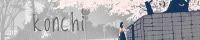
Fifth banner (current):

Ok…now, where do we start? I actually had some problems in making it not look THAT plain because I have close to zero ideas in filling up empty spaces. >.<. I took the original scan and pasted it on a canvas of 780 x 200 so that it would fit this WordPress theme’s actual header size and painted the brownish parts on the right. It was a pity that I must cut out Briareos’ ‘rabbit ears’, lol (Character from Appleseed). Added fonts, that gun-cursor brush, tiny letters brush and some lines. At first, I stopped there until I experimented with some cloud brushes. Yes, those cloud brushes made that smokey effect. Good thing I did that, or not the banner would’ve looked quite plain. >w<. Oh yeah, to take away that slightly dirty blue on Briareos, I changed the opacity of a gray texture to “saturation”, which explains why the blue is now gray.
Hopefully I got everything cleared. ^_^
Scans from Akibakko & AP ; Brushes from DeviantArt ; Fonts from Dafont
Kona


I really don’t know why you didn’t like your second banner. It was simple, but quite beautiful.Though new one is greater!
@Gargron:
Lol, I don’t know why…might be because how I rotated it. XD
And, oh wow, thank you! That last compliment was so nice~ X3
Nice banners! My favorite is the second and third one, it looks beautiful for me… 😀
Great job Kona! ^^
@Kaze:
Awwww, thank you. ^_^
Ahaha, you like the 2nd banner too eh. :3
Thank you for your compliment. XD
wow kona, ure good at this, I kind of like all of em XD
@Yuki:
Awwww, thank you sooo much! XD
Hahaha, it’s a good thing you like the first one too. Fariz said it was fugly, lol. X3
hm.. i think the only problem is tat its too dark
@Yuki:
Hmm, yeah, you’re quite right, but it did look quite good when I was using it. :3
Fariz said it was because it didn’t suit me, lol! XD
nice banneer ^^
@Kona
perhaps u like to customize ur theme and make your blog wider.
your comment box is wider than the content width 😮
@oOgA:
Thank you. ^_^
Hahaha, I do really want to customise my blog, BUT, wordpress doesn’t allow me to touch anything in the CSS part…;_;
And, hmmm, comment boxes are the same as the contents. I think your computer is viewing it differently…:X
You are one amazing artist Kona-chan.. I love all the banners except for the first one.. XP
Anyway, that is just my opinion though.. Its good to try out as many as you can so that you know which one suits you the most..
And I agree with oOgA about the comment box; It’s slightly bigger than the contents itself..
Other than that, I am very proud of you.. ^^
@Onii-chama:
Awwww, thank you. X3
Lol, yeah, I remember that you don’t really like it. ^^;;. But it’s ok. :3
Ahaha, yep. I might try one with a more loli-like feel when I am done with this one. I am wondering what feel it would give, though. XD
Are? It’s actually fine with me; the length is the same. Maybe it’s due to the size of your computer screen or it’s an optical illusion, hahahaha. ^o^
Thank you again, Onii-chama. :3 *huggles*